

Darren
-
Posts
1 -
Joined
-
Last visited
-
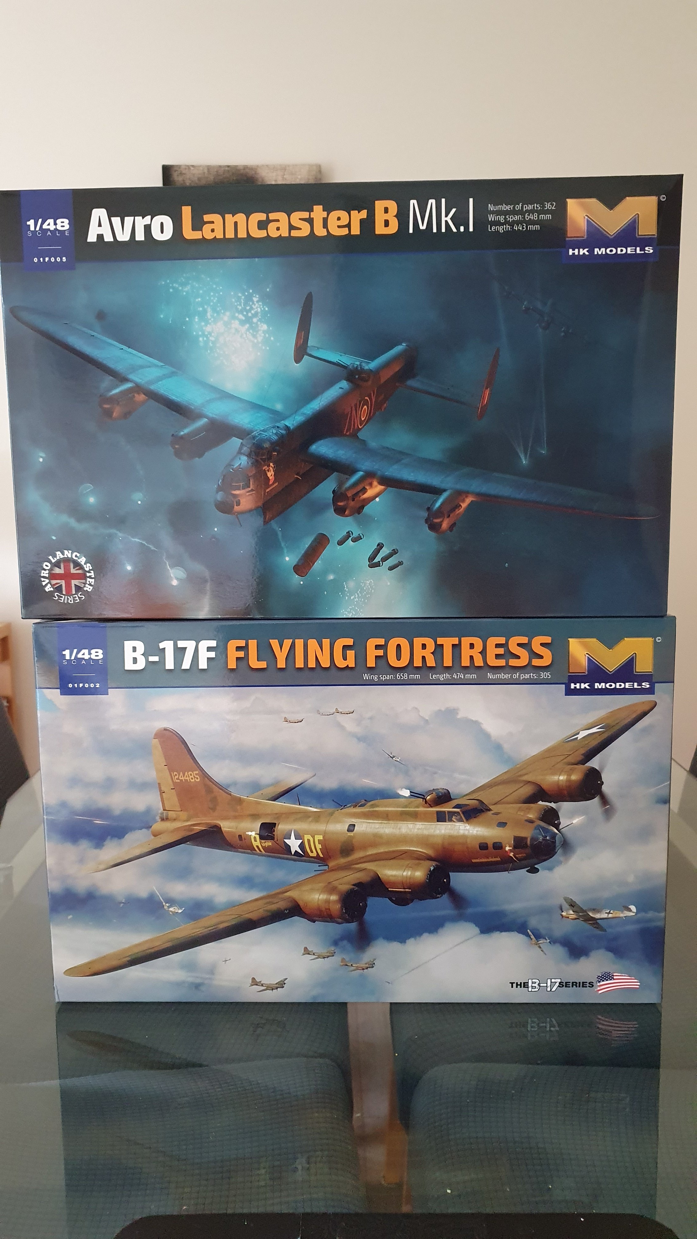
Only just noticed myself but look at the Lancaster box art. See how ' Lancaster ' is in gold colour? Well the ' B' should be in the same font and typeface as 'Mk.I '. Now look at it again and forevermore you will see in gold ' Lancaster B'. Especially when viewed from a distance it looks really wrong!
- 1 reply
-
- 1
-