

GazzaS
-
Posts
6,405 -
Joined
-
Last visited
Content Type
Profiles
Forums
Events
Gallery
Posts posted by GazzaS
-
-
2 hours ago, belugawhaleman said:
I like the figure. I'll be following this build as I have the Takom/Ammo 1/16 Spanish
Breda gun variant of the Panzer 1a. I also have Takom's Panzer 1b which might
be my next build. Not sure if the figure's face reminds me more of Boris
Karloff or Raymond Massey. There's a manufacturer of resin stuff, SOL, that
makes figures in 1/16. These include WW2 and modern figures including
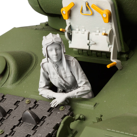
female subjects. I like their Soviet female tank driver in 1/16 but she's pricey.
Unfortunately Covid has made ordering from Korea problematical. I actually had an order with them when Covid hit. It took almost a year to get it. Those were 1/35 figs. Their 1/16 figs aren;t cheap.
-
 4
4
-
-
7 minutes ago, DocRob said:
I liked it the way it was, but it's hard to tell from the pics, with the lightning being completely different.
Cheers Rob
Unfortunately, Rob.... The green was eating at me. Like a mustache on the Mona Lisa. I'm still experimenting with my light box.
-
3
-
-
When the Takom Pz I came out, I ordered one straight away. But.... looking for figures cooled my ardor for the scale. Jeff Shiu makes great figures... but they ain't cheap, and the the cost of shipping from the US... raises the cost into the realm of not-gonna-happen.
So, anyway I settled on the Tamiya guy. I thought "how bad could it possibly be?"
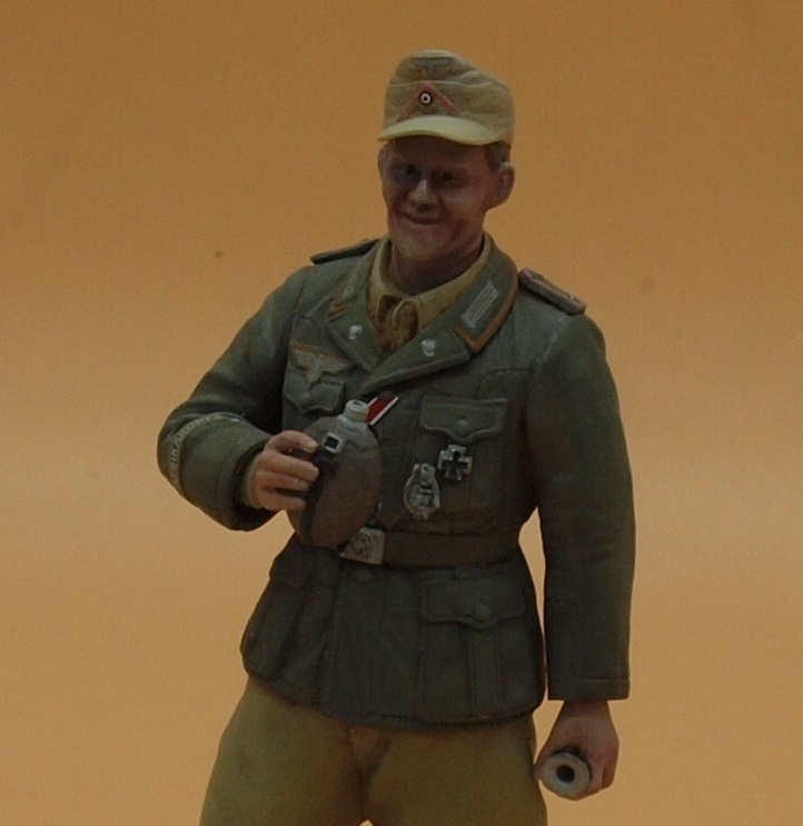
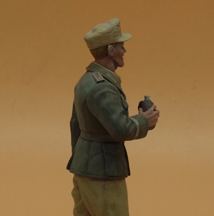
After assembling him, I thought something was wrong. Mid way through painting, I realized what it was. His head is not to scale. And... instead of getting him a new head, all they did was extended the chin to almost double what would be proportionally correct.
Anyway... despite his Frankenstein face... he's with us for the duration.
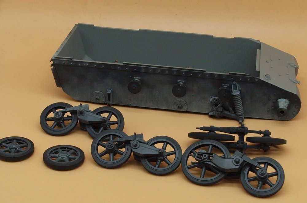
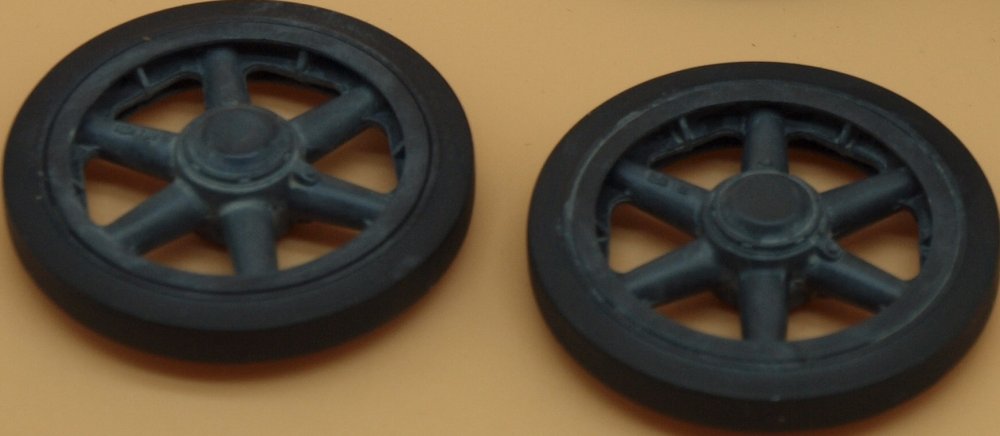
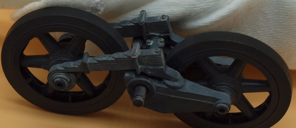
So... yeah... I started this one a while ago painting the hull tub and assembling some of the suspension, and it's been sitting in a relatively dust free space while I built lots of other stuff. But, with the Albatros in a state of drying, and a cardboard palette full of paints I decided to restart the PZ I and dust up it's chassis and suspension with oil paints... this is another new thing to learn. Here are some pics... feedback and advice... always appreciated.
Happy Modelling!
-
5
-
-
After adding a gray layer to the hitherto green area, I think it looks a little better. Though I may have overdone it on the vertical stab.


-
4
-
-
Very nice looking painting of the nozzle, Kai. I can see a sooty appearance already beginning.
-
3
-
-
All of that resin looks great! Can;t wait to see it painted.
-
4
-
-
1 hour ago, HubertB said:
And, btw, I like your shadowing work, Gaz
")
Hubert
Thank you, Hubert.
-
2
-
-
2 hours ago, Jeff said:
I agree with the guys, Gazz, looking top drawer.............. hey , now I need some advice from you... I have the Encore Blue Max Pfalz, I have heard the Roden landing gear is a bit delicate, do you think I should buy the SAC Pfalz gear for the Roden kit??
Jeff, avoid that SAC stuff. As Hubert says.... it's crap. Basically all the guy has done is to mold the original part and cast it in a soft, fragile metal that is weaker than the kit part. This is what I did back on the first page:
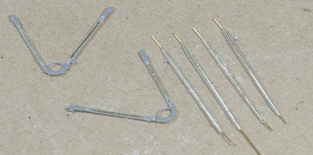
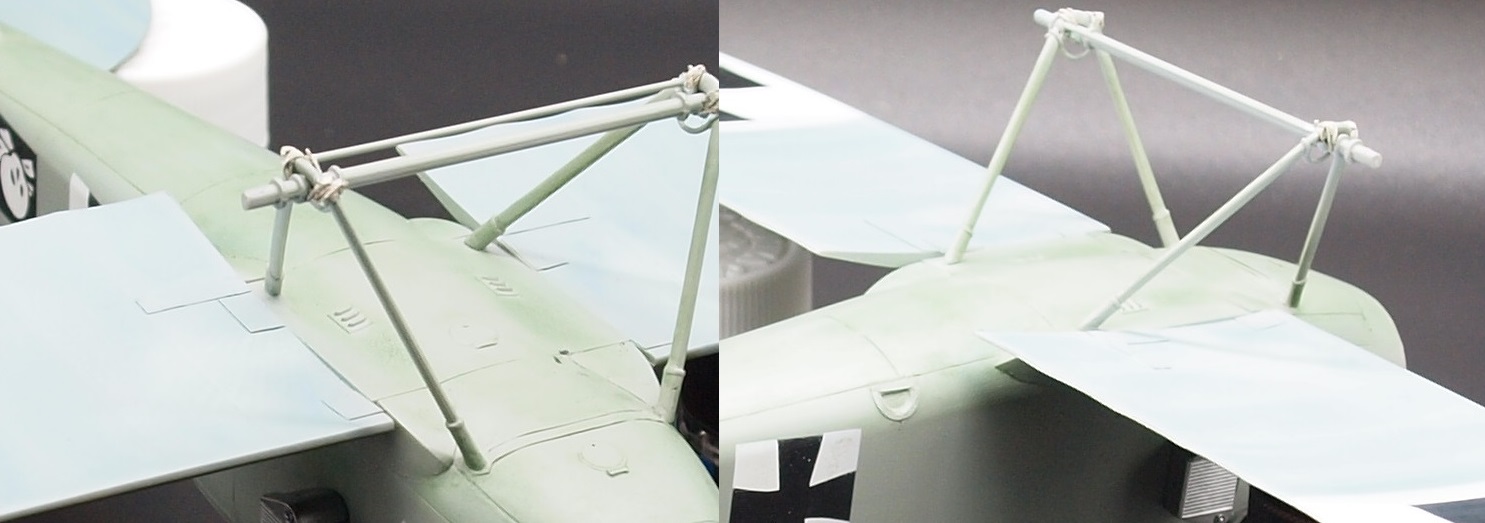
My landing gear struts are now rock solid. Take your time, and use your scribing tools and a razor saw to slowly and gently make a trench. Once you have made a recess big enough for the wire, drop in the wire, and fill it with CA... and sand it smooth as soon as it's dry. Don't wait overnight as the CA will reach diamond hardness.
If you have a cheap electric sanding device, you can make finer, quicker motions than you can with your hand. Since I converted an electric toothbrush into a power-sander, my sanding time has probably been reduced by 60%, and the damage done to surface detail has also been reduced.
-
4
-
-
3 hours ago, Kaireckstadt said:
Interesting description of the technique you used Gary!
My personal feeling is that with the buff oilcolor you totally achieve the goal you wanted to reach. This is perfect in my eyes and what can be seen on a foto (the real thing for sure looks different).
The green oilcolor shadows for me are too prominent. But that is only my personal feeling and the way my eyes look at it.
For me they seem to be much more intense than the buff shadows.Rob has a different opinion but that’s absolutely ok because it’s really based on subjective perception.
Nevertheless this is an awesome build and I really like how you (and Rob too) test new techniques!
Kai
Thank you Kai. I was definitely happier with the top result than the bottom. I may blend in some gray to soften the impact of the green. The buff area isn;t really a shadow, it's more an effect of more light catching the upper areas.
-
2
-
-
8 hours ago, Peterpools said:
Gaz
Shading looks spot on
Keep 'em comin
Peter
Thank you Peter!
-
2
-
-
11 hours ago, DocRob said:
I like your shadowing Gaz, the green hue is part of the palette of colors used, so that's fine by me. I experimented a lot with oil colors and pigments year the last year and found, it's best to stay in the array of colors used for shading or use vibrant often contrary colors, which involved pink orange and violet tones in some cases. You can learn a lot about color techniques and shading from good figure painters, some of them seem to have found the holy grail of color rendition.
Another important thought is always 'go with the imagined lighting', nothing looks worse than false shadows.Cheers Rob
Thanks, Rob. I appreciate your input. False shadows seem part-and-parcel of modelling nowadays. It's basically what is often done with a pin wash. Creating a shadow around a detail to bring it to the fore. I've always been fascinated by artwork where a color is illustrated without that color even being used.
-
3
-
-
Welcome back hombres!
AS promised... another update.
Every once in a while you meet someone in the modelling world who rocks your modelling conceptions to their very foundations. One day I met this guy named Steve over at Armorama. Another Aussie, he did things far and away different from the old standards of dot filters, and pre-shading. He would do fantastic things with armor models, and you wouldn't even realize how he reached spectacular finishes unless he told you. Though I've lost contact with him, with each model I try to find ways to do things like he might have.
For instance... in the below photo... He used a pink filter in places on this T-72
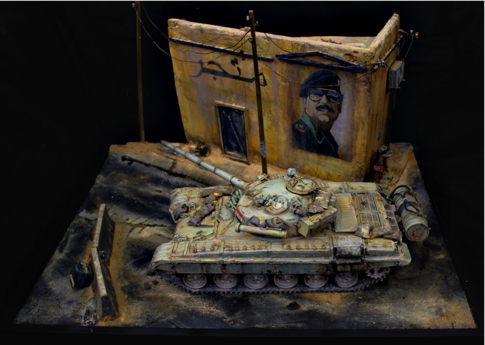
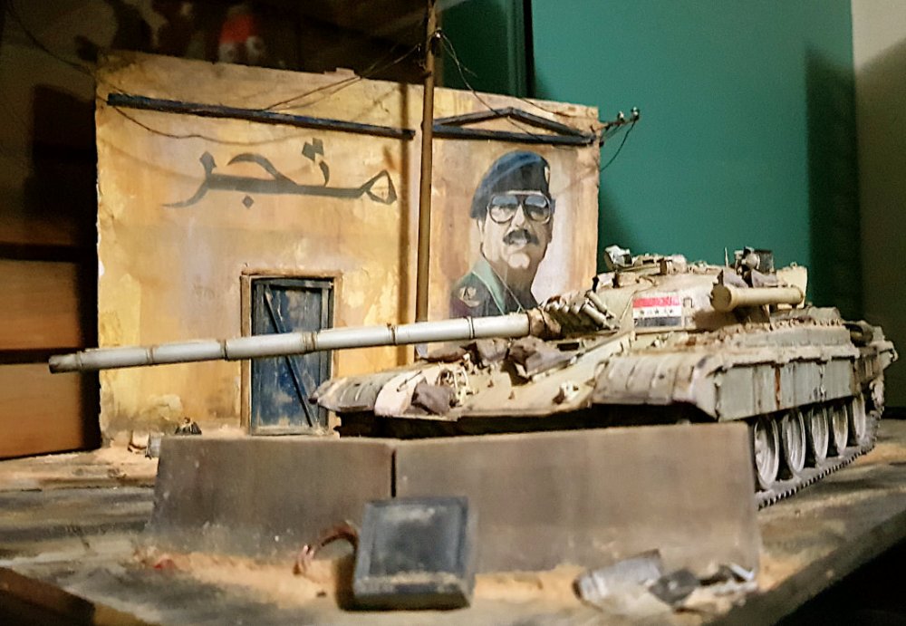
This color rich tableau has has inspired me to move beyond the more traditional weathering steps. I know I haven't reached his level, yet. But I hope to someday.
So....here's what I've been up to.

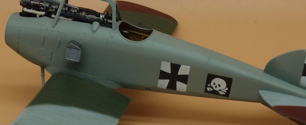
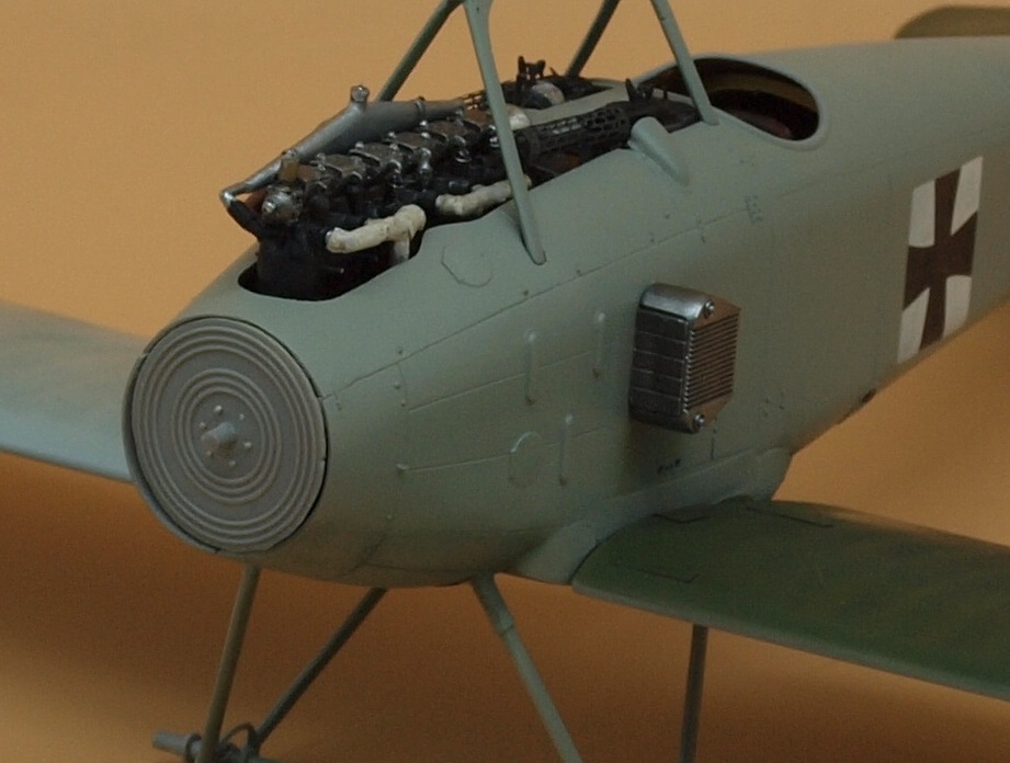
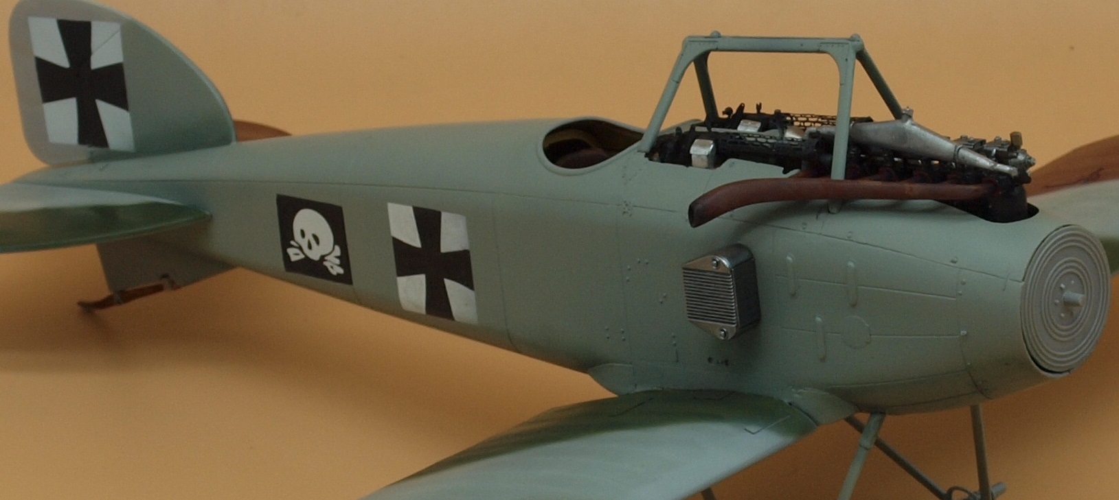
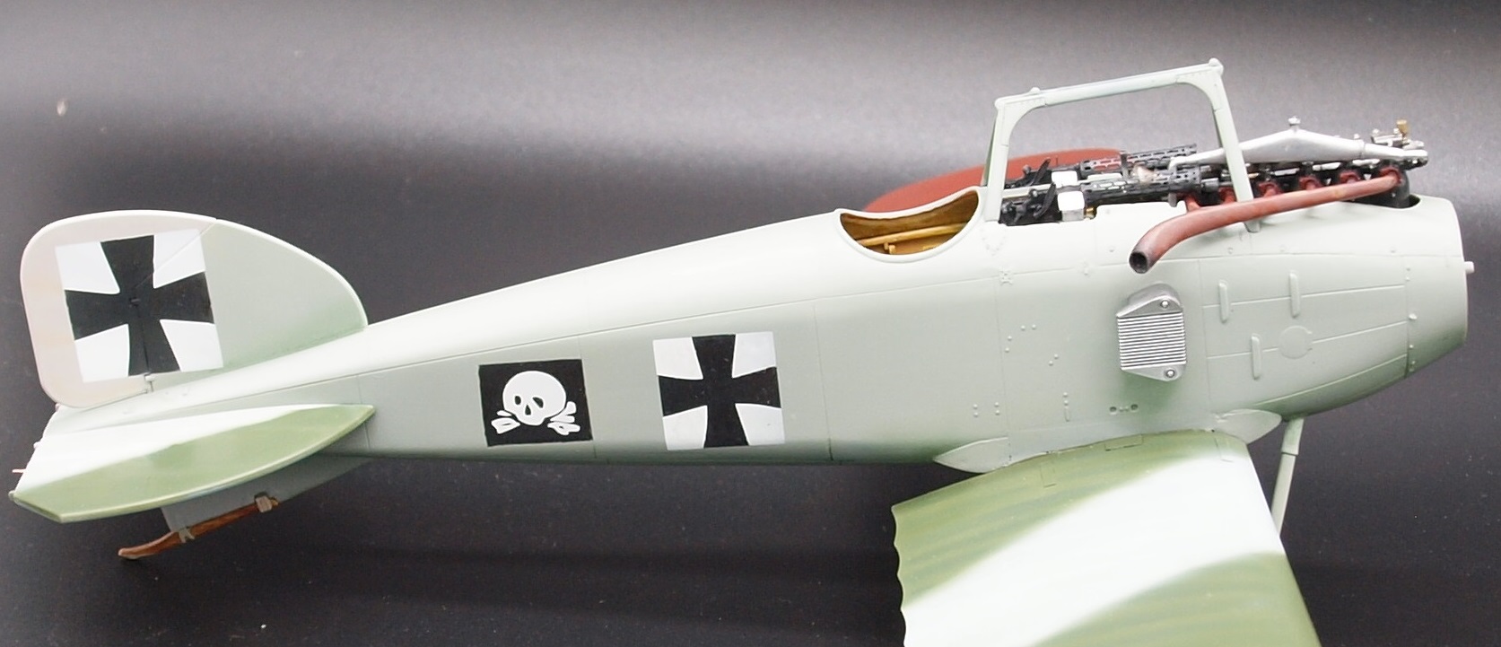
On the ventral curved surfaces, at the base of the vertical stabilizer, and at selected areas of the struts, I used green oil paint to add shadow. I don't really know if I'm sold on the green. I'm hoping you guys will offer some insight if I've failed.

On the curved dorsal surfaces, the top of the vertical stabilizer and selected areas on the struts, I've used a buff colored mixture in oils to lighten and highlight the line between the slab sides and the arched top.

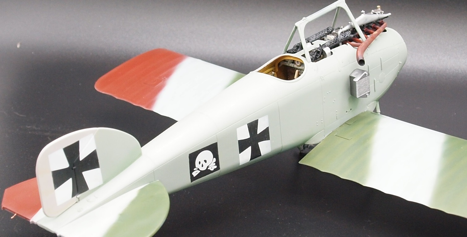
In this photo the dark shade at the bottom of the vertical stabilizer is lightly more prominent... I've also made small shadows under the 'ear' radiators and under horizontal stabilizers.
In this final photo, there isn't much worthy of remark except for a couple of smudges I used between the wings to add shape that normally isn't picked up by the camera.

Happy modelling!
-
7
-
-
15 hours ago, KevinM said:
All I can say is "Nice!"

Thank you, Kevin!
-
3
-
-
16 hours ago, Peterpools said:
Gaz
On my monitor I'm seeing the black now leaning towards very dark gray and the white leaning towards a very pale gray, which both seem fine to me.
Keep 'em comin
Peter
Thank you, Peter!
15 hours ago, Kaireckstadt said:Gary, my comrade in the right sense
 ,
,
To my personal opinion the weathering of the black and white looks absolutely realistic! Exactly the way I like it: subtle and not exaggerated! I think this will also be visible under a matte cote.
Not far away from the finish-line, Gary! Maybe you already cross it on Thursday?
Thank you Kai. There's no way it will be done Thursday, as much as that would be nice. Tonite, I hope to paint the dorsal fuselage with oils and set it to dry. Then if dry tomorrow, I will clear coat the fuselage. After that, the pin wash. Yes... still gotta have a pinwash. Though I'm still debating the colors. Thankfully, the other D.I's I posted on the previous page show that neither black nor brown is the right color for the job. I will mostly use a darker shade of the fuselage color.
Anyway, the oils for tonite are seeping linseed oil into some rough cardboard and hopefully I'll find time tonite to do the area I want.
-
3
-
 1
1
-
-
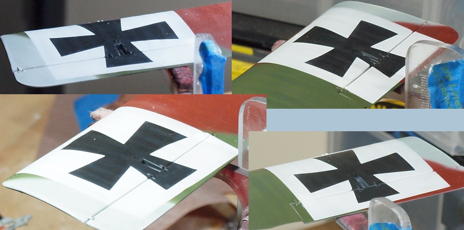
G'day Comrades... not in the Socialist sense, though. But in styrene.
On work days, I have little time or energy for modelling. But I did continue work on the wing. My key goal was subtlety. White and black have different rules from other colors, I believe. White reflects light while black absorbs it.
And effects need consistency to be believed. But I was very apprehensive about attacking the cross fields on the upper wing. So... I have no way to know how this will look once a matte coat is applied. Here is a collage of the upper wing crosses:

I worked on the fuselage today, but no pics. I'm trying to use oil paints to bring out the unique shape of the fuselage.
I have Thursday off... I hope to accomplish something noteworthy then.
Happy modelling!
-
6
-
-
7 hours ago, HubertB said:
I could venture that WnW would have sold more Spad XIII and Caudron G-3 than Gotha G1 and UWD, and maybe would still be around... But then, that’s just me looking for trouble

Well done CSM !
Hubert

Anything but fighters was a huge mistake until they ran out of well-liked fighters to make.
-
5
-
-
Some great work already, Johnny B! Color me interested!

-
4
-
-
Great job, Kai! A huge transformation from what the LG once were! Now, you're getting close!
-
5
-
-
What caught my eye was the figures for the Tamiya 1/35 scale Pz IVG. They look really nice and natural.
-
6
-
-
3 hours ago, Clunkmeister said:
To me, in the 50s, this has always been the epitome of high style.
1957 Ford Fairlane 500 Skyliner.
It makes that Bel Air look positively dumpy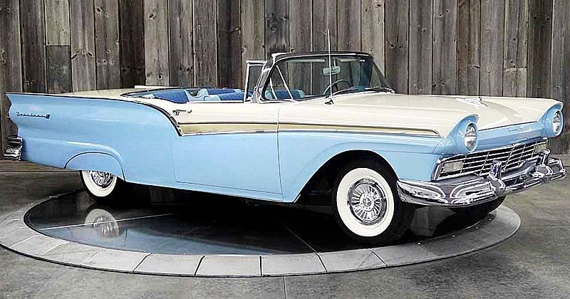
slide the hardtop back into the trunk and you have the ultimate cool car. I’d lose that goofy Continental spare wheel though, factory option or not, it looks stupid
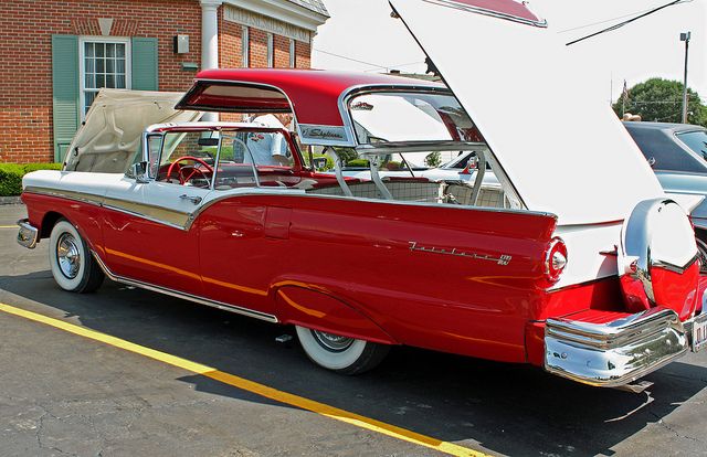
But it was all about the Douglas!
I really don;t care much for older cars. Maybe a 63' corvette split window or maybe a 71 camaro splut bumper. Older cars are just novelties, really.
-
4
-
-
1 hour ago, Jeff said:
Even though Phil put me in the back row, I am feverishly taking notes for my build, and this is an awesome tutorial, for me to try to expand my mediocre skills
51 minutes ago, Peterpools said:Gaz
Outstanding results with the oil weathering - light and subtle ... it's there and for me, adds to the depth and feel of the model.
Gaz, thanks so much for the tutorial ... I've been struggling with just this weathering effect and am going to give it a whirl on the interior of my P-39 and see how it goes.
Keep 'em comin
Peter
Thank you, fellas! I am glad to be of help.
-
4
-
-
This is really more about the Douglas....

-
2
-
-
Just now, Kaireckstadt said:
Thanks for this super tutorial Gaz.
I can print this out and use it as an instruction!
And at the end it is possible to seal everything with flat varnish?
You are welcome.
Yes, you can seal everything in flat varnish. I usually give the oils a week to dry before I add any other effects or coats. Be sure before you use the oils to place them on a piece of rough card-board and let them sit for three hours to leach out the linseed oils in the paint. Otherwise... it can take a very long time for the paint to dry.
-
3
-
-
2 hours ago, DocRob said:
The oil treatment turned out great. It results in a very realistic look. I like the little differences in the three camo colors, which enhances the realism to my eye.
Cheers Rob
Thank you, Rob!
-
3
-


Takom Panzerkampfwagen I 1/16 scale... with figure
in LSM 1/35 and Larger Work In Progress
Posted
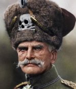
From reading, I know the Germans at the front weren't often put through the same crap a peacetime US soldier today might get regarding shaving. But a full beard is pretty rare.